Once printed
digital archive of printed publications designed by Raoul Audouin + collaborations
The Arnhem Tapes
- 2022
- 10 x 6,3 cm (Compact Cassette)
- marker felts and CNC machine
- [paper]
Cover for The Arnhem Tapes, a set of songs written and recorded between January and March 2022 in Arnhem, Netherlands.
Table of Futile Evenings, coasters
- 2022
- ø 10 cm
- screenprinting
- 1,5 mm cardboard
Coasters designed for Werkplaats Typografie’s 2022 End of the Year Show, Table of Futile Evenings.
Time to Access, visiting card
- 2022
- 8,5 x 5,5 cm
- laser printing
- white coated paper, 300 g/m²
Visiting card designed for Amsterdam-based architecture studio Time to Access, as part of the design of their visual identity and website.
In Deep with the Weapons of my New Life, booklet
- 2022
- 19 x 26,5 cm
- laser printing
- double sided paper, white coated front, off-white uncoated back, 120 g/m²
Design and images for Emma Hazen’s autotheoratical text In Deep with the Weapons of my New Life, published for her exhibition of the same name.
In Deep with the Weapons of my New Life, posters
- 2022
- 80 x 100 cm
- laser printing
Posters for Emma Hazen’s exhibition In Deep with the Weapons of my New Life.
Poesia Logica-Philosophica
- 2022
- 10,5 x 14,8 cm
- laser print
- double sided paper, white coated front, cream uncoated back, 300 g/m²
Three questions that do not refer to anything but themselves.
Moon Folds
- 2022
- 21 x 29,7 cm
- laser printing
- copy paper, 80 g/m²
Partly logic, partly magic poem about reaching the Moon by folding a piece of paper.
Crosses & Circles
- 2022
- 19 x 26,5 cm
- risograph printing
- cream uncoated paper, 120 g/m²
This publication confronts a set of cross and circle games and draws on the slow evolution, as they travel, of these collectively-owned language-like patterns. On the back of the cover is printed a letter from Galileo to Cosimo II de' Medici where he explains the statitics behind the dice game of Hazard, an early example of the scientific method.
Thirty-Five
- 2021
- 11 x 16 cm
- laser print
- white coated paper, 110 g/m²
Contribution to Thirty-Five, a 2022 calendar edited by Emma Hazen. One page for each month of the year, an interpolation between seasons and the printing process.
Maquillage as Meditation
- 2021
- 12,5 x 20 cm
- 168 pages + cover
- offset printing
- cream uncoated paper, 90 g/m² —cream uncoated paper, 135 g/m² — off-white coated paper, 110 g/m²
Published by If I Can’t Dance, I Don’t Want To Be Part Of Your Revolution, Sara Giannini’s Maquillage as Meditation concludes her research on and around Italian actor, author, director, philosopher, and public persona Carmelo Bene. With contributions by Snejanka Mihaylova, Jacopo Miliani, and Arnisa Zeqo.
Ethereal Zero P(layer)
- 2021
- various formats
- laser printing
- white coated paper, 150 g/m²
Series of flags generated with Fred Cave’s Zero Player script, a script that generates partially random posters from a given set of images. Zero Player was “fed” images of flags of extinct states. The flags were printed and exhibited during the exhibition Ethereal Zero P(layer) at Galerie du Crous, Paris. The exhibition acted as a posthumous collaboration with Fred Cave, who passed away in 2017.
Place des Fêtes, 53–73
- 2020
- various formats
- offset printing
Series of images for the essay Place des Fêtes, 53–73, written for and published in Diorama #2: Geometric City. The essay draws a relation between Victor Vasarely’s depiction of a utopian city in his Notes Brutes (written in 1953 and published in 1973) and the evolution of mass urbanism in France during the two same decades, from the launch of a public plan to promote tower blocks developments in 1953 to their prohibition in 1973.
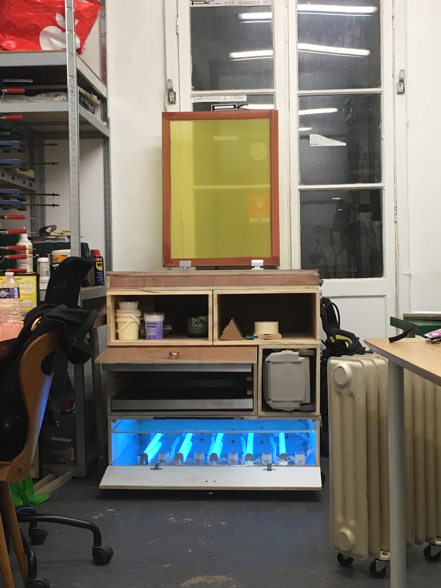
Screen Raster
- 2020
- 40 x 10 cm
- screenprinting
- cream uncoated paper, 150 g/m²
Composition designed to test and tune a personal 40 x 60 cm screenprinting press. The PDF version is accessible here.
Outward Specimen
- 2019
- 16 x 27,7 cm
- 20 pages
- laser printing
- white uncoated paper, 80 g/m²
Specimen for Outward, a free and open-source typeface distributed by Velvetyne Type Foundry.
On Acausal Connecting Principles
- 2018
- various format
- white and fuorescent orange sticker paper
Series of stickers of crater lakes and lava flows designed as a part of Heterotropics#4: On Acausal Connecting Principles curated by Sara Giannini, a series of interventions and performances at the M HKA in Anterwp, exploring the synchronicities between the 1883 Krakatoa eruption, the demise of the Dutch Colonial Empire, and the Amsterdam International Colonial and Export Exhibition taking place while the volcano erupted.
An Imperfection Often Concealed
- 2018
- 18,2 x 25,7 cm (Japanese B5)
- 100 pages + cover + dust jacket
- laser printing
- cream coated paper, 75 g/m²
2018 graduation catalogue for the Master of Artistic Research of the KABK, edited by Sara Giannini. Using a Japanese binding, the images are placed on the inside fold of the thin paper, slightly visible through its transparency, the text and the image captions being placed on the visible side. An imperfection — cutting open the folding of the pages — must happen to reveal the content.
Goutte
- 2017
- 13 x 19 cm
- 12 pages
- laser printing
- white uncoated paper, 90 g/m²
Goutte narrates the lifecycle of a drop of water, and took part in the collective publication Les 3 âges de la vie, published by Mourir Heureux. See also Soleil.
Maxi Hard Lounge Discount 5K
- 2017
- various formats
Collaboration with Julie Héneault and Paul Bernhard. Material generated with the Print Capsule for the exhibition Maxi Hard Lounge Discount 5K at PC art space in Annecy. Coping with restricted resources to design an individual design for each exhibition, the Print Capsule was developed to automatically generate future communication material without a need for designers.
Soleil
- 2017
- 14 x 20 cm
- 7 pages
- laser printing
- white uncoated paper, 90 g/m²
Soleil catches a glimpse in a far future. It took part in the collective publication 50 dans la boîte, published by Mourir Heureux. See also Goutte.
Produce & Collect, postcard
- 2017
- 14,8 x 10,5 cm
- double-sided
- offset printing
- double sided paper, white coated front, cream uncoated back, 250 g/m²
Collaboration with Julie Héneault and Paul Bernhard. Postcard designed for Produce & Collect, first exhibition of PC art space in Annecy. See also Produce & Collect's stickers, sticker poster and floorplans/flyers.
Produce & Collect, floorplans/flyers
- 2017
- 21 x 29,7 cm
- double-sided
- laser printing
- cream uncoated paper, 90 g/m²
Collaboration with Julie Héneault and Paul Bernhard. Set of flyers distributed during Produce & Collect, first exhibition of PC art space in Annecy. The front reads 4 distinct curiatorial texts while the back shows a map of the exhibition. See also Produce & Collect's stickers, sticker poster and postcard.
Produce & Collect, sticker poster
- 2017
- 42 x 59,4 cm
- screenprinting
- white sticker paper, 120 g/m²
Collaboration with Julie Héneault and Paul Bernhard. Sticker poster designed and produced for Produce & Collect, first exhibition of PC art space in Annecy. The information on the poster disappears and spreads as people collect the stickers on the poster. See also Produce & Collect's stickers, floorplans/flyers and postcard.
Produce & Collect, stickers
- 2017
- 21 x 29,7 cm
- 8 pages
- laser printing
- white sticker paper, 120 g/m²
Collaboration with Julie Héneault and Paul Bernhard. Set of stickers designed and produced for Produce & Collect, first exhibition of PC art space in Annecy. See also Produce & Collect's sticker poster, floorplans/flyers and postcard.
Language Documents
- 2016
- 8.5 x 11 in
- 24 pages
- laser printing
- white uncoated paper, 28 lb
Language Documents, Texts from the Archives is a printed retrospective issue of the online quarterly published by ArteEast, a New York-based non-profit organization supporting artists and art initiatives from the Middle East and North Africa.
Makhzin, Feminisms
- 2015
- 15 x 24 cm
- 80 pages + cover
- laser printing — risograph printing
- cream and red uncoated paper, 90 g/m² — cream uncoated paper, 200 g/m²
Makhzin is a literary journal dedicated to experiments in prose, fiction, and poetry. Taking the Middle East and North Africa as its point of departure, it spans different continents and languages. Makhzin is published in Beirut by 98weeks and edited by Mirene Arsanios. See also Makhzin’s Inaugural Issue.
Å
- 2015
- 28,7 x 40 cm
- 28 pages
- laser printing
- double sided paper, white coated front, cream uncoated back, 120 g/m²
Publication presenting Clara Patricelli’s Å fashion collection. Expressing a reinterpretation of modernist scandinavian design and architecture, her collection was shot in Louis Carré’s house, entirely designed by Alvar Aalto in 1957 and located in the outskirts of Paris. The publication brings together Andrés Baron’s photographs of the collection in the house today and photographs of the house shot at the time it was built.
Makhzin, Inaugural Issue
- 2015
- 15 x 24 cm
- 48 pages + cover
- offset printing
- cream uncoated paper, 90 g/m²
Makhzin is a literary journal dedicated to experiments in prose, fiction, and poetry. Taking the Middle East and North Africa as its point of departure, it spans different continents and languages. Makhzin is published in Beirut by 98weeks and edited by Mirene Arsanios. See also Makhzin Issue 2: Feminisms.
Magazine
- 2014
- 19,5 x 27 cm
- 70 pages + cover
- laser printing
- cream coated paper, 110 g/m² — cream coated paper, 170 g/m²
This publication starts with an attempt to construct an objective critical view on images found in contemporary magazines. Restraining my subjectivity, with an anti-author attitude, I selected images solely on their appearance, seeking in magazines images constructed around a geometrical center, and happened to find only fashion ads. I edited this selection to emphasize their center, hoping this collection would enlighten the attitudes behind their conception.
The Power of the Centre
- 2014
- 10,5 x 18 cm
- 158 pages
- laser printing
- cream uncoated paper, 90 g/m²
This publication is a reinterpretation of the eponym book by Rudolf Arnheim, published in 1982. While the original The Power of the Center inquires the role of the center — in all its different meanings — across the history of western art, my reinterpretation isolates the artworks reproductions from the original book and place their quoted center in the geometrical center of the layout. This center is holed through the book, leaving only the outskirts of the artworks and revealing the systematical figures placed in these centers.
VOICE ~ CREATURE OF TRANSITION, program
- 2014
- 29,7 x 21 cm
- 12 pages
- offset printing
- white uncoated paper, 100 g/m²
Collaboration with Nam Hee Ji and Paul Bernhard. Program of the conference-festival of VOICE ~ CREATURE OF TRANSITION, the 2015 edition of Studium Generale Rietveld Academie and Rietveld Uncut. Exploring the subject “voice” through weekly lectures, a conference-festival, a student exhibition and an extensive framework of events, V~COT’s design used subtitles as a bond throughout its communication material. See also V~COT’s map, flyer and stampcard.
VOICE ~ CREATURE OF TRANSITION, map
- 2014
- 21 x 29,7 cm
- 4 pages
- laser printing
- yellow uncoated paper, 90 g/m²
Collaboration with Nam Hee Ji and Paul Bernhard. Map of the student exhibition of VOICE ~ CREATURE OF TRANSITION, the 2015 edition of Studium Generale Rietveld Academie and Rietveld Uncut. Exploring the subject “voice” through weekly lectures, a conference-festival, a student exhibition and an extensive framework of events, V~COT’s design used subtitles as a bond throughout its communication material. See also V~COT’s program, flyer and stampcard.
VOICE ~ CREATURE OF TRANSITION, flyer
- 2014
- 21 x 14,8 cm
- double-sided
- offset printing
- white uncoated paper, 220 g/m²
Collaboration with Nam Hee Ji and Paul Bernhard. Flyer announcing VOICE ~ CREATURE OF TRANSITION, the 2015 edition of Studium Generale Rietveld Academie and Rietveld Uncut. Exploring the subject “voice” through weekly lectures, a conference-festival, a student exhibition and an extensive framework of events, V~COT’s design used subtitles as a bond throughout its communication material. See also V~COT’s program, map and stampcard.
VOICE ~ CREATURE OF TRANSITION, stampcard
- 2014
- 8,5 x 5,4 cm
- double-sided
- laser printing
- yellow uncoated paper, 250 g/m²
Collaboration with Nam Hee Ji and Paul Bernhard. Stampcard to access the weekly lectures of VOICE ~ CREATURE OF TRANSITION, the 2015 edition of Studium Generale Rietveld Academie and Rietveld Uncut. Exploring the subject “voice” through weekly lectures, a conference-festival, a student exhibition and an extensive framework of events, V~COT’s design used subtitles as a bond throughout its communication material. See also V~COT’s program, map and flyer.
Macro structures in the shadow of written language
- 2013
- 18,5 x 27,5 cm
- 16 pages
- laser printing
- cream coated paper, 110 g/m²
Macro structures in the shadow of written language is edited around two parallel narration. The verso pages present commented excerpts from a debate between Noam Chomsky and Michel Foucault in Eindhoven, 1969. On top of the fact they converse respectively in English and French, the shift the of the debate from a scientific argument on the human nature to a plain ideological debate is striking.
The recto pages present a collection of population census forms, from which all textual information has been removed. Are left only the signs and marks that restrict and organize the writing, as a microscopic witness of the organization of these states.
Countrified Suburban Youth Afternoon
- 2013
- 59,4 x 84 cm
- laser printing
- white uncoated paper, 80 g/m²
Countrified Suburban Youth Afternoon presents a collection of pictures photographed between 2004 and 2007 by upper middle class teenagers — I was one of them — from the suburbs of Paris. The pictures were initially published on Skyblog, one of the first and main blog platform used by teenagers back then. The publication aims to shine a light on a culture and territory that is either too recent, and perhaps too mainstream or dull to ever raise any interest, and be conceptualized by sociology. The publication comes with an essay, (S)cream in the soup, that describes how a conception of the Punk movement distorted by MTV became the main cultural influence of these suburban teenagers.
I can see small things from my window
- 2013
- 20,3 x 28 cm
- 44 pages + cover
- laser printing
- cream coated paper, 110 g/m² — cream uncoated paper, 120 g/m² — red uncoated paper, 170 g/m²
In a first chapter, I can see small things from my window presents a collection of pictures of buildings in Paris. In each picture, one can see people passing by, whose size expresses the scales of the buildings, but also recalls that there is a gap between the time and scale of the builded city and of those who live in its streets. The second chapter frames each of the pictures on these anonymous, at a human scale. In an attempt to give a personality to these anonymous rulers, I imagined a story for each of them, that can be listened at raoulaudouin.fr/smallthings.
Resistance
- 2013
- 21 x 29,7 cm
- 18 pages
- laser printing
- cream uncoated paper, 120 g/m²
Design of Lotte Boon’s thesis Resistance in which she approaches the concept of resistance through different models: social and political resistance, electric resistance and resistance in the arts. The thesis is designed as a user guide, a solid handy manual bound with nuts and bots screwed through the head of the book.
Interview of Michelangelo Antonioni in Rome, July 29, 1969
- 2012
- 10 x 18 cm
- 44 pages + cover
- laser printing
- cream uncoated paper, 90 g/m² — white coated paper, 170 g/m²
This publication presents a selection of stills from Antonioni’s films, from Le Amiche (1955) to Zabriskie Point (1969). The stills overlap an interview of Antonioni made after Zabriskie Point, making the text unreadable, and let suppose that the images can say more than their author’s words. All these scenes picture frustrations resulting of unclear seduction games between the characters, which I consider to be a specific point of Antonioni’s films. Set chronologically, the stills express how the directors’s view on his characters, but also the technics and manners evolve in time.
Inputs, Outputs & Disputes
- 2012
- 40 x 60 cm
- double-sided
- offset printing
- cream coated paper, 110 g/m²
This poster-publication worked as an visual identity for Inputs, Outputs & Disputes, an installation made in collaboration with Jérémie Rentien, Stig Steijner and Mehdi Vilquin. The installation brought together a set of instruments developed to incline novice musicians to instinctively, primitively play together. The publication presents interviews of people who never played music and insist on their relations towards instruments.
Extra Time
- 2012
- 21 x 29,7 cm
- 12 pages
- laser printing — screen printing
- blue, white and red uncoated paper, 80 g/m²
Extra Time delves into one of the only, and surely most intense collective national feeling I innocently experienced: the 1998 FIFA World Cup Final, contested by Brazil and France. The publication narrates the three minutes of extra time — ended by a goal by Emmanuel Petit — through different points of view: as seen from the ball, from the supposed thoughts of the players, and from the commentators.
Suggestion de présentation
- 2012
- 59,4 x 84 cm
- laser printing
- white uncoated paper, 120 g/m²
Poster commissioned by Agathe Frasson-Cochet with the notice “please make the perfect poster”, for her exhibition Suggestion de Présentation (serving suggestion). A serving suggestion being an ideal visual (and only) presentation, the poster gathers images reaching, as distant memories, forms of perfection. A building by Émile Aillaud, a painting by Fernand Léger, a still from Once Upon a Time in the West and a frame from The Adventures of Tintin are altered as fragments of perfect memories.
Statements
- 2012
- 21 x 29,7 cm
- 30 pages
- laser printing
- white uncoated paper, 90 g/m²
A collection of thirty absurd, satirical, straight forward, sometimes funny or stupid détournements of famous statements, made in collaboration with Boyon Kang.
Victory over the Sun
- 2012
- 10 x 18 cm
- 52 pages + cover
- laser printing
- cream uncoated paper, 90 g/m² — red uncoated paper 120 g/m²
An expressive book formatting of the 1913 Russian Futurist opera Victory over the Sun, displaying Zaum, Supra and Zvuk, three typefaces drawn for the circumstance.
Accidental Systems
- 2011
- 18 x 25 cm
- 92 pages + cover
- laser printing
- cream, grey and light green uncoated paper, 90 g/m² — green uncoated paper 120 g/m²
Accidental Systems presents a collection of systems with set of rules intended to be completed by the reader/player with color pens and a ruler. The publication aims to comment on the gap which characterize the ideal result of an unapplied system, and the random, accidental outcome resulting of its application. Empty, this book is a perfect, industrially printed collection of rules; completed, each book becomes a unique accumulation of accidentally completed patterns.
Thirty posters
- 2011
- 29,7 x 42 cm
- 52 pages
- laser printing
- double sided paper, white coated front, cream uncoated back, 120 g/m²
This publication gathers together a collection of thirty posters designed during six weeks upon my arrival in Amsterdam. They both work as a diary of these restless weeks and display much of the visual desires brought by the new influences I then encountered.
Le Simplet
- 2011
- 21 x 29,7 cm
- 20 pages + cover
- laser printing
- recycled off-white uncoated paper, 90 g/m² — red uncoated paper, 90 g/m²
A simple typeface for which the design aims to reveal the intention of being a simple typeface.
Deux mois sous le cagnard
- 2010
- 14,8 x 21 cm
- 40 pages
- laser printing
- recycled off-white uncoated paper, 90 g/m²
This publication, written and designed after a two months internship at Artkas, narrates the time spent there. Deux mois sous le cagnard is arguably the first publication I entirely designed.